
Table of Contents
Color grading is one of the most powerful tools a filmmaker has for shaping mood, guiding emotion, and transforming ordinary footage into cinematic storytelling. Adobe Premiere Pro offers a robust set of professional color tools, but achieving truly cinematic results requires more than simply applying LUTs or adjusting sliders randomly. It involves understanding visual psychology, mastering technical precision, and applying creative restraint. The following advanced techniques will help elevate your grading workflow and deliver polished, theatrical visuals.
TLDR: Achieving cinematic color in Premiere Pro requires intentional contrast shaping, precise color balance, intelligent LUT usage, controlled saturation, and stylistic consistency. Use Lumetri Scopes to maintain accuracy and avoid guesswork. Build your grade in structured layers rather than overcorrecting in one panel. Finally, treat color as emotional storytelling, not just visual enhancement.
1. Build Contrast with Purpose Using Lumetri Scopes
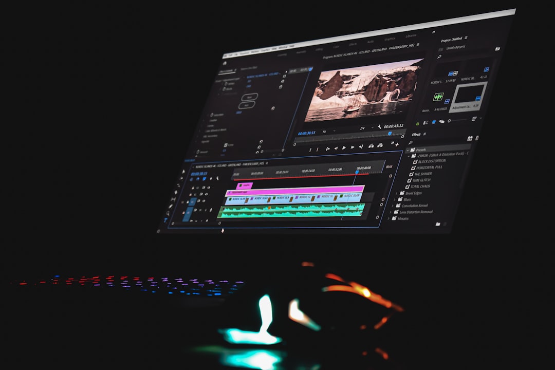
Great cinematic images are defined by controlled contrast, not just brighter highlights and darker shadows. Instead of relying solely on the Program Monitor, use the Lumetri Scopes to shape your tonal range with precision.
Image not found in postmetaFocus on these adjustments:
- Waveform (Luma): Keep shadows near 0–5 IRE and highlights below 95–100 IRE to prevent clipping.
- RGB Parade: Identify imbalances between color channels.
- Vectorscope: Monitor skin tone alignment along the natural skin tone line.
For a cinematic look, avoid crushing blacks excessively. Modern film aesthetics often feature soft contrast with gently lifted blacks. You can achieve this in the Curves panel by creating a subtle S-curve, then slightly raising the shadow endpoint to introduce softness.
This technique maintains detailed shadows while still adding dimension, helping your footage feel organic rather than overly processed.
2. Master Color Temperature Before Creative Adjustments
One of the most common mistakes—even among experienced editors—is skipping proper white balance correction before stylizing the image. Always correct technical color accuracy before applying creative intentions.
Start in the Basic Correction panel:
- Adjust White Balance Selector using a neutral reference point.
- Fine-tune Temperature and Tint manually.
- Balance exposure before touching creative settings.
Even small imbalances in white balance can undermine cinematic consistency. Cooler shadows combined with slightly warm highlights often produce an appealing depth. However, these stylistic shifts must be intentional—not corrections for poor balance.
Professional workflows follow a structured hierarchy:
- Exposure correction
- White balance accuracy
- Contrast shaping
- Creative color styling
Respecting this order prevents muddy grades and maintains flexibility during revisions.
3. Use Color Wheels for Emotional Separation
The Color Wheels & Match panel is where cinematic separation truly begins. Instead of adjusting the entire image globally, manipulate shadows, midtones, and highlights separately to create depth.
A widely used cinematic technique involves:
- Cooler shadows (subtle blue or teal shift)
- Neutral midtones for skin accuracy
- Warm highlights for natural light glow
This approach enhances dimensionality without appearing exaggerated. The key is moderation—push color wheels gently. Over-rotation leads to artificial results.
To protect skin tones, avoid pushing midtones too far. If necessary, isolate skin with HSL Secondary and apply corrections without affecting the environment.
Remember: cinematic color often feels natural at first glance. If the grade is immediately noticeable, it may be overdone.
4. Apply LUTs Strategically, Not Blindly
LUTs (Lookup Tables) can accelerate grading, but relying on them as a final solution typically leads to generic visuals. Instead, treat them as starting points.
Best practices include:
- Apply LUTs in a separate Lumetri instance.
- Reduce LUT intensity using the Intensity slider (try 40–70%).
- Fine-tune exposure and saturation after LUT application.
You can also stack Lumetri effects to separate correction and creative styling layers. For example:
- Layer 1: Technical correction
- Layer 2: Contrast shaping
- Layer 3: LUT or creative look
- Layer 4: Finishing adjustments
This layered approach mirrors professional color grading workflows seen in high-end productions.
Comparison Chart: Premiere Pro Color Grading Tools
| Tool | Best Used For | Strength | Risk if Overused |
|---|---|---|---|
| Basic Correction | Exposure and white balance | Fast foundational fixes | Flat or washed look |
| Creative LUTs | Stylized mood shifts | Quick cinematic base | Generic appearance |
| Curves | Contrast shaping | Precision tonal control | Crushed blacks or clipping |
| Color Wheels | Shadow and highlight separation | Depth and emotion | Color contamination |
| HSL Secondary | Skin tone isolation | Targeted adjustments | Visible masking artifacts |
5. Control Saturation with Discipline
Many editors equate cinematic visuals with vibrant colors. In reality, cinematic films often use controlled or even restrained saturation. Over-saturation reduces realism and makes images appear commercial rather than theatrical.
Advanced technique:
- Lower global saturation slightly (90–95%).
- Boost selective color saturation via Curves Hue vs Sat.
- Reduce saturation in shadows for a refined look.
Desaturating shadows mimics the natural behavior of film stock and prevents color noise. Meanwhile, maintaining healthy midtone saturation ensures skin tones remain lifelike.
For added authenticity, apply subtle vignette adjustments with low feather and minimal intensity. Avoid heavy dark edges—cinematic vignettes are barely perceptible.
6. Establish Visual Consistency Across Shots
No single frame defines cinematic quality. Consistency across the sequence is what creates a cohesive viewing experience.

To maintain continuity:
- Use Adjustment Layers for shared stylistic grades.
- Match shots with Color Wheels & Match automatic comparison tools.
- Continuously monitor scopes between clips.
The automatic “Comparison View” can provide a helpful starting reference, but always refine manually. Lighting conditions, lens differences, and camera movement all impact perceived color.
Additionally, evaluate your grade on multiple displays when possible. What appears subtle on one monitor may look extreme on another. Professional color accuracy requires calibrated screens and consistent environmental lighting.
Bonus: Think Like a Cinematographer, Not Just an Editor
True cinematic grading is guided by intention. Ask yourself:
- What emotion should this scene evoke?
- Should the viewer feel warmth, tension, nostalgia, or detachment?
- Does the grade support the narrative arc?
For example:
- Thrillers: Lower saturation, cooler midtones, higher contrast.
- Romantic scenes: Warm highlights, softer contrast, gentle glow.
- Documentary realism: Neutral color balance, moderate contrast.
Cinematic quality is rarely about extreme looks. It is about subtle emotional reinforcement.
Final Thoughts
Advanced color grading in Adobe Premiere Pro requires both technical control and artistic restraint. By working systematically—correcting exposure and white balance first, shaping contrast carefully, applying emotional color separation, and maintaining shot-to-shot consistency—you can produce visuals that feel deliberate and refined.
The most important principle is moderation. Cinematic grades often succeed because viewers do not consciously notice them. Instead, they quietly enhance storytelling, supporting mood and atmosphere without distraction.
When used with intention, Premiere Pro’s Lumetri tools are more than capable of delivering professional, film-inspired visuals. Mastery comes not from using every slider, but from understanding which adjustments to make—and when to stop.