
Table of Contents
Quality is tough to measure and assess. It depends on many factors, and it can be that your processes are indeed on a good level of quality, yet being aware of current standards can be crucial for the future of your business. Quickly and efficiently solving ongoing issues and dealing with emerging problems is the key to process improvement.
Depending on the nature of your business and processes, you might find some tools unnecessary, yet testing them in the real world is the only way to determine if they work. Go through our list of the 6 basic quality tools for process improvement, and pick a few you want to implement immediately!
Histogram
Starting with what is there is always a good idea, so our list begins with a visual representation. A histogram contains an x-axis with a range of vertical columns representing data. The numbers in the vertical bars can be numerical or percentages of the value you wish to represent.
This tool is very effective in detecting the bottleneck of your processes. Through it, you can represent all of the values that you already have. The advantage is that it is much easier to notice what value is falling behind and not following others. These values can be measurements, time of production, or anything else related to a specific process.
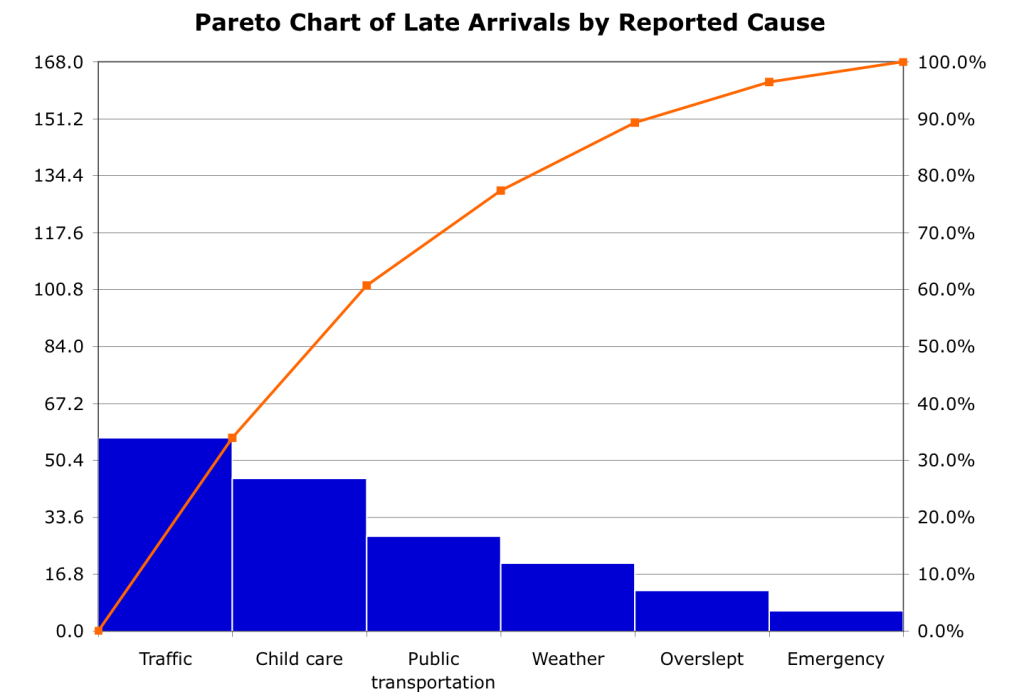
Pareto chart
Operating on the 80-20 rule, using a pareto chart is another way to get an external perspective of your processes. The idea behind the rule in this tool is that 80% of problems appear from 20% of individual factors involved in the process.
A pareto chart is a tool that helps you find significant problems coming from causes that are usually overlooked. It is a great way to communicate data within the team and improve processes by analytically locating reasons for slowing down your processes.
Scatter diagram
A Scatter diagram is the most effective tool for determining the relationship between variables in your process. It contains the x and y axis, and dots represent data in the intersections of two values. When you join the dots, you get a diagram that indicates in which direction you should put effort into implementing new solutions and optimization.
Stratification
Stratification contains the same elements as the previous tool on this list. Stratification differs in how the data is represented within the x and y-axis. Different data sets are represented with different shapes, such as triangles, squares, and circles, that can be in different colors. This tool enables you to take time into account and to represent data sets change in the given metric of time.
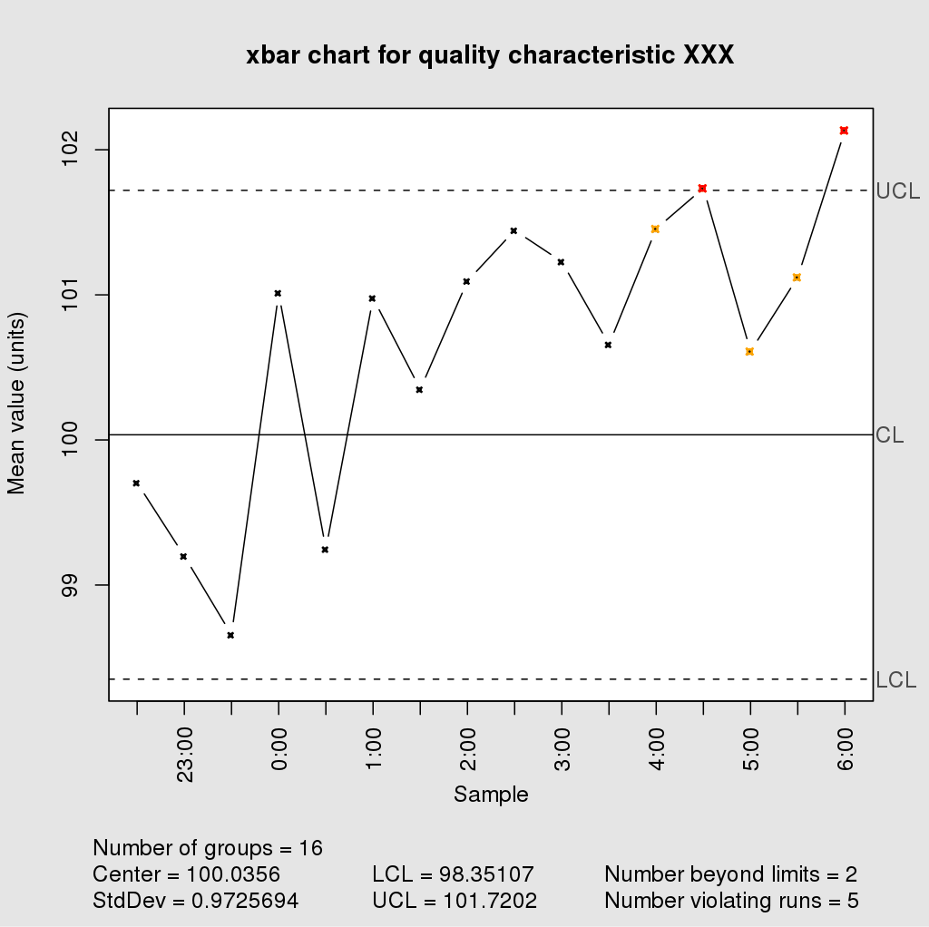
Control charts
Optimizing your business would most likely benefit from stability and predictability. To have these elements in your business model, you first need to look at how your processes contribute to this. Control charts are a great tool to represent data that you have to assess the future and how your processes will most likely perform.
Check sheet
Last on our list is a less conventional tool since it doesn’t depend on a two-dimensional axis like most of the tools on this list. A check sheet is used both for qualitative and quantitative data. Another way to call this tool is a defect concentration diagram. This name comes from the fact that this tool gives you insights into defects, problems, and all related elements that can bring the quality of your processes to an unsatisfying level.
Conclusion
Even though tools on this list emerged in the last century in Japan, they are more than relevant today. Professionals dealing with quality use them in everyday work since they are effective yet easy to understand for business owners and managers.